Onboarding Setup guide Redesign
WePay | Chase Merchant Center | Web tools
I am currently working as a Senior Product Designer at WePay. WePay is a startup acquired by Chase in 2017 and supports Chase with its integrated payment solution service, which helps small-medium business merchants process over $50B credit card transactions a year. In this project, I redesigned the onboarding setup guide for the Chase Merchant Center.
Project Duration: 4 weeks
Team: PM, Engineering team
My Responsibilities: user interviews, stakeholder alignment, UIUX design, prototyping, user testing and engineering hand off
Design Process
This was my self-initiated project. I worked closely with my product team and show my design progress with other team members at different stages.
. . .
(Context)
Background
After merchants open new accounts with Chase, they need to finish a set of “Setup Guide” tasks in order to start processing payments and withdrawing earnings. In the past, there were only 4 tasks. But as our product grew and onboarding process becoming more comprehensive, number of tasks required has been increasing over time.
Previous design:
problem
Users started to feel overwhelmed as the Setup Guide gets longer.
We observed prolonged onboarding time and the decrease of onboarding success rate from customer. The regression was concerning and became a business objective we were aiming to drive. Therefore, refining the setup guide naturally became a part of onboarding enhancement initiatives when I proposed it.
…
(Discovery and Define)
Understanding
Uncovered needs by conducting interviews for users and product stakeholders.
At first, I wanted to ask for usage data to help inspect over user behavior and identify refinement opportunities from the previous onboarding experience. But I was told that we were not able to capture usage data because we didn’t get permission from Chase. As a workaround, I started with user interviews and design evaluation to examine the previous design.
User Findings:
In summary, users need a Setup Guide that displays information with better hierarchy and clarity to guide them through the onboarding. Next, I talked to the product team to understand the story on the product side, which led me take action to understand the product context to close the gap between product and end-users.
Product-Stakeholder Findings:
During discovery phase with product stakeholders and my research and context gathering, I came to realize that there are some intricacies between tasks. For example, some tasks are only available once their prerequisite tasks are completed. And different tasks carry different priorities in terms of their order to completion. In the old design, we did not consider this piece at all. It slowed down and confused the user because they had to figure out navigating all the ambiguities. Like why some tasks are disabled and what is the right place to start etc.
We should have taken care organizing the tasks and providing a streamlined workflow. Therefore, I mapped out task prerequisites and task availability to articulate their relationships and priorities. This helped both the product team and me to align on the product logic and task arrangements.
…
(Ideate)
Deep Dive
Identified my design tasks
With all the learning and findings, I had two main tasks at this time:
finding a scalable entry point for setup guide so that the new solution can last long even when hosting more tasks in the future
clear up and visualize task dynamic so that setup guide has better clarities for users
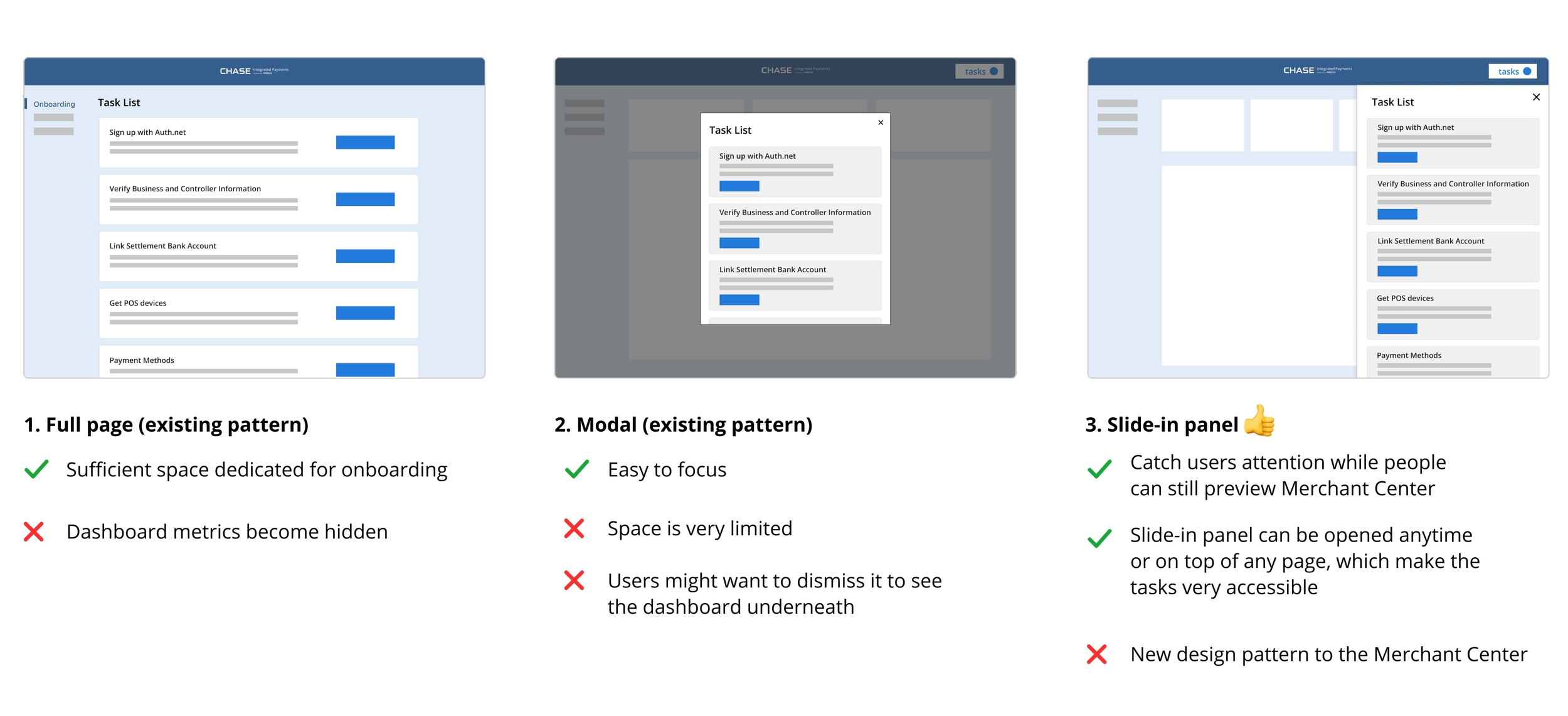
1. Finding scalable entry points
Initially I was trying to see if I could utilize the existing design patterns, like a full page or a modal, but they were not ideal. In the end, I decided to invest on a new design pattern which I was able to convince the engineering team and get their fully support by showing the benefits of this pattern and potential ways of reusing it for future projects.
2. clearing up and visualize task dynamic
Even though the task relationships in the latest setup guide only includes independent tasks and tasks with pre-requisites, I also considered other possible task relationships and explored design concepts to cover the future use cases, such as optional tasks, tasks in sequence, etc. That way when we bring more tasks that introduce other interrelationships in the future, the design can still be adaptable.
Challenge
Shorten average onboarding time was one of WePay’s business goals.
Besides fixing the usability and the scalability issues, I also wanted to bring in more design value to this project. I was looking for design treatments that could motivate users to keep making progress on the Setup Guide. In the end product, I utilized the approach to label the tasks with goals that users could achieve upon task completion. And because the goal is something that users care, it will bring more attentions and motivations to users.
During brainstorming section, I also had other ideas around creating reminders, support resources, tutorial materials and promotion campaigns — which all needed additional resources and effort to build. However, at that particular stage, I was only looking for a low-cost design treatment or strategy to motivate users. Therefore, the goal-driven approach would be prioritized and launched first.
Hand-off to Engineering team
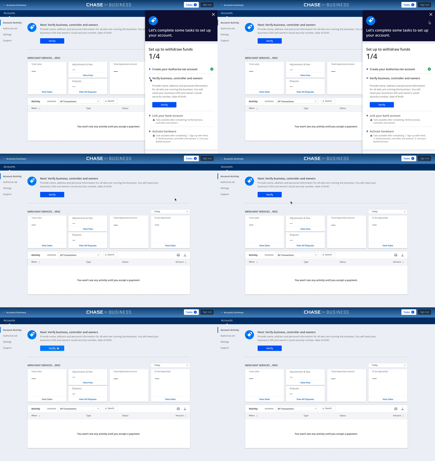
In the end, I handed off the project with a high-fi prototype, the UX mapping and the standardized components. The standardized components help in the future when we add new tasks to the setup guide, the components would be ready to be reused for the new task right away and increase development efficiency.
Learnings
Because this is an ongoing project, I don’t have the end result data to share. However, this was one of the first designer-initiated projects at WePay. In the past, the team was used to get assigned projects and told what to build from leadership.
As a self learning from this project, i realized we designers can always find opportunities to influence and shape the product with design thinking even from bottom up.
In addition, to build a trustful partnership with cross-functional teams, it’s always nice to:
Be curious and learn from my stakeholder about their needs;
Be proactive and drive project end-to-end;
Involve them from early on and work collaboratively during the process.
Thanks for reading!
Please reach out to me if you are interested in learning more design process :)


