
Greenlight
Uber Eats | Restaurant Dashboard | Tablet
Greenlight is a project created to provide more clarity about restaurant status by adding a status indicator on Restaurant Dashboard, the tablet that restaurants used to accept delivery orders from Uber Eats. This project has been launched globally.
Project duration: 6 weeks
My role: framework design, wireframe, UI design, prototyping
. . .
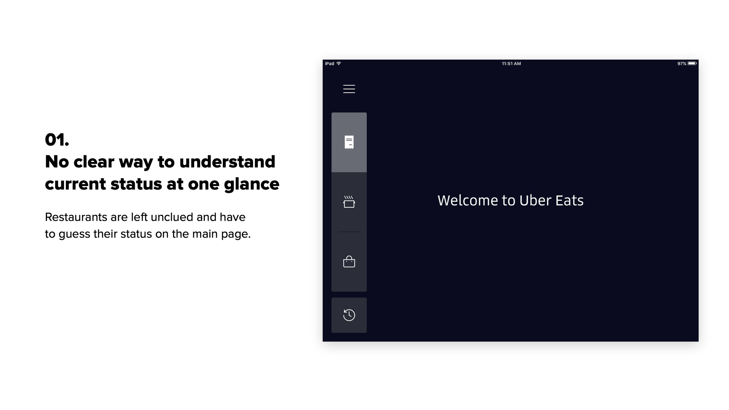
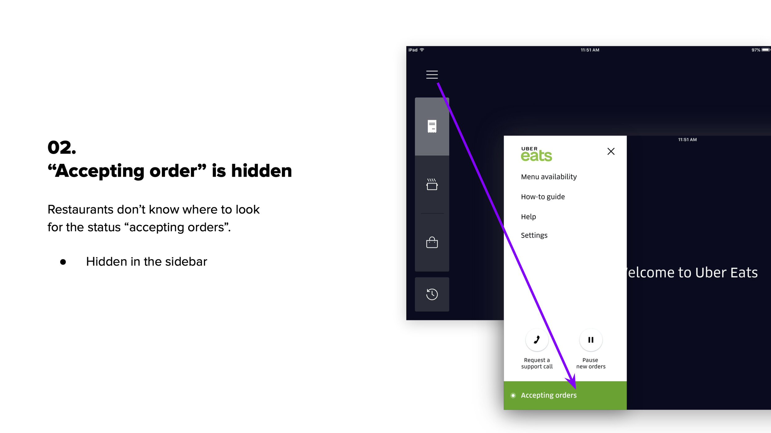
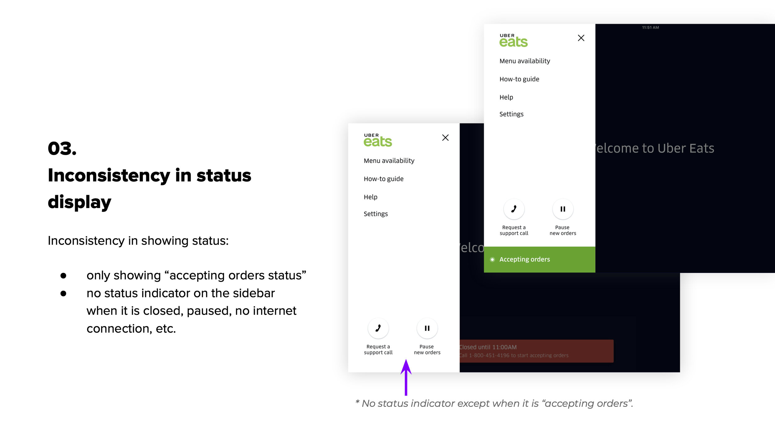
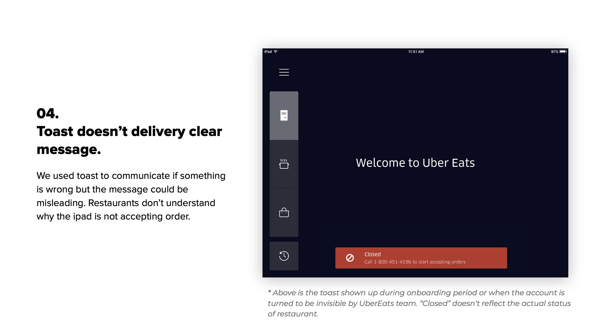
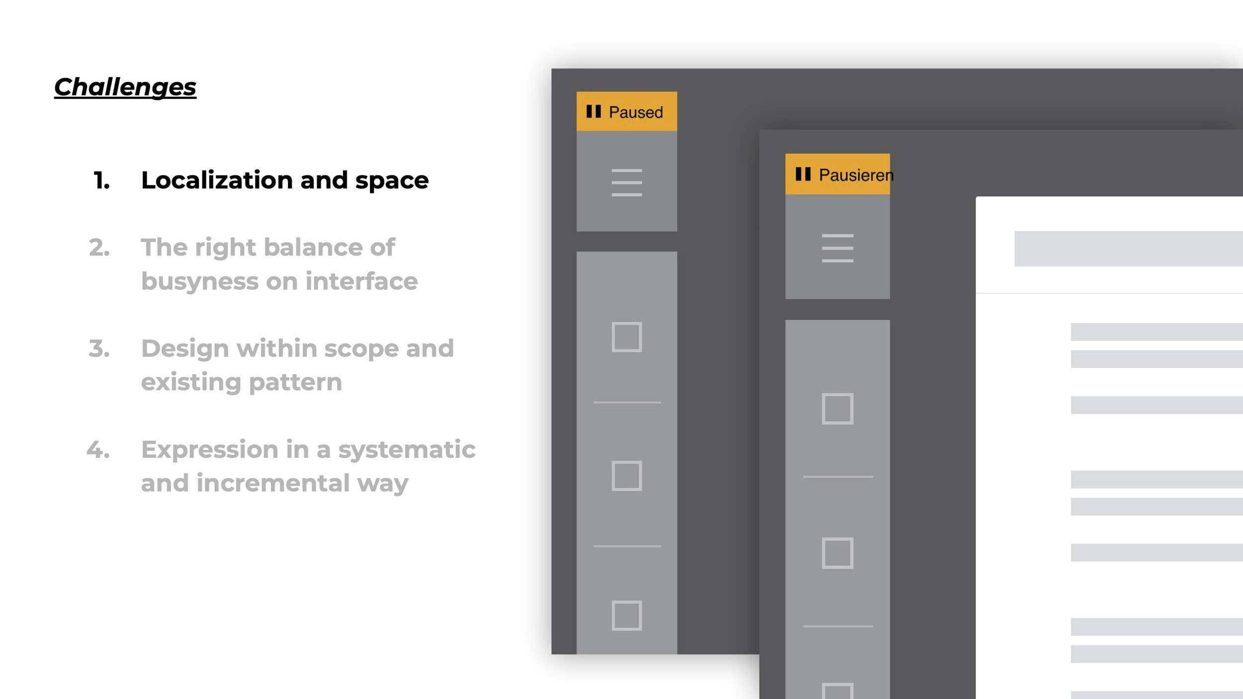
Problem
Restaurant status on Restaurant Dashboard was unclear.
Restaurant Dashboard(RD) is what restaurants use to accept orders (i.e. the tablets you might see in the restaurant). Prior to the existence of project, restaurant staff were confused why there weren’t order came in as we communicated status on RD vaguely. This project is created to show restaurant status on the main Restaurant Dashboard screen in order to solve staff confusion around current status.
(problem deep-dive)
↓
. . .
(ideation and design)
Investigation
Understand the horizon
In order to have a bigger picture of status on Restaurant Dashboard, I started by investigating the stages a restaurant would encounter during its lifespan on Uber Eats. From the moment after they sign up on Eats to different scenarios restaurants will encounter on the Tablet:
I identified a total of 8 statuses that would be covered in this project:
Onboarding / Accepting orders / Paused / Outside of business hour / No internet connection / POS error / Invisible / Autopause
Next, I connected the dots by closely watching them to find out the patterns.
Concept
Create a framework that every status finds its own place
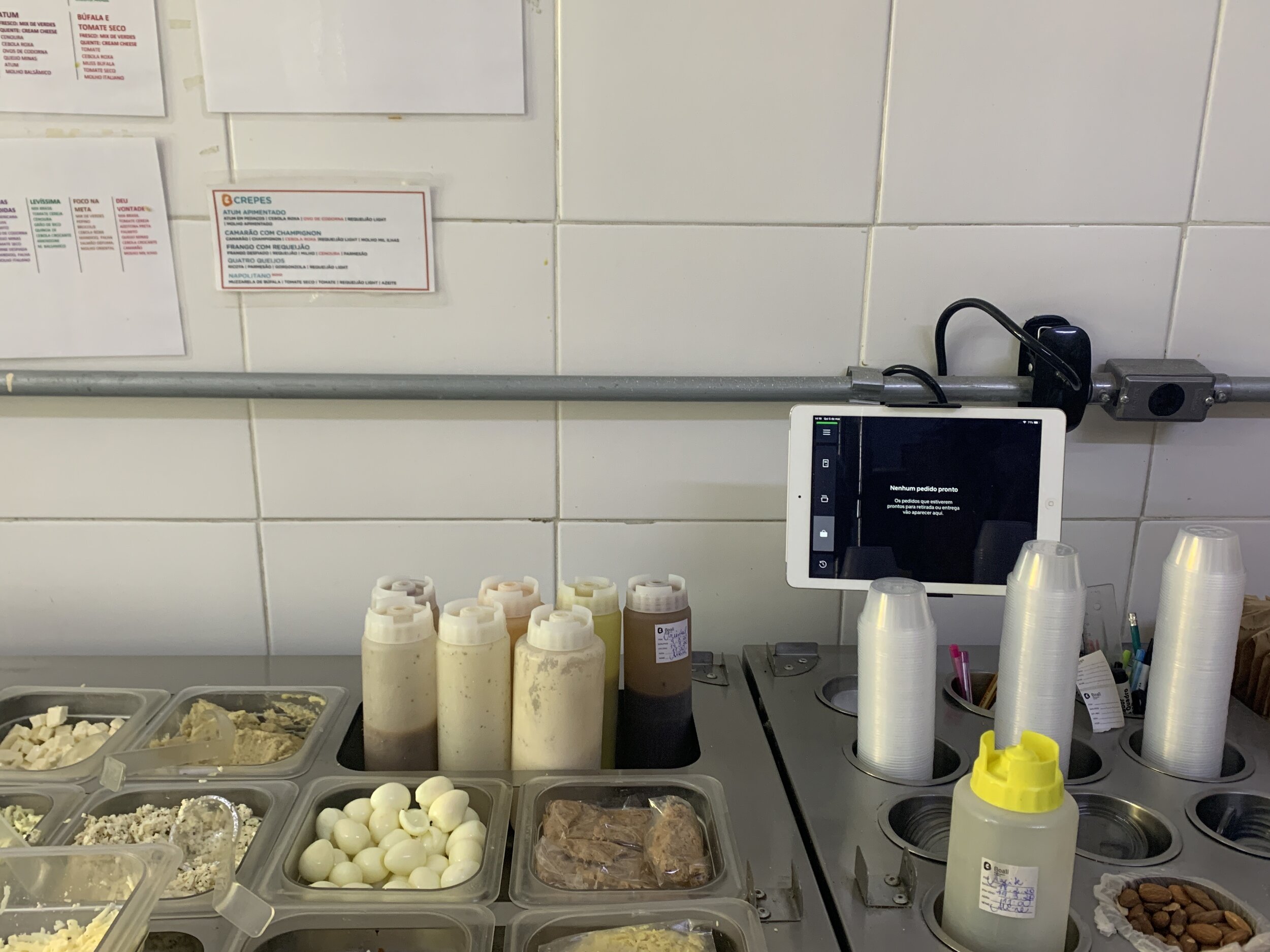
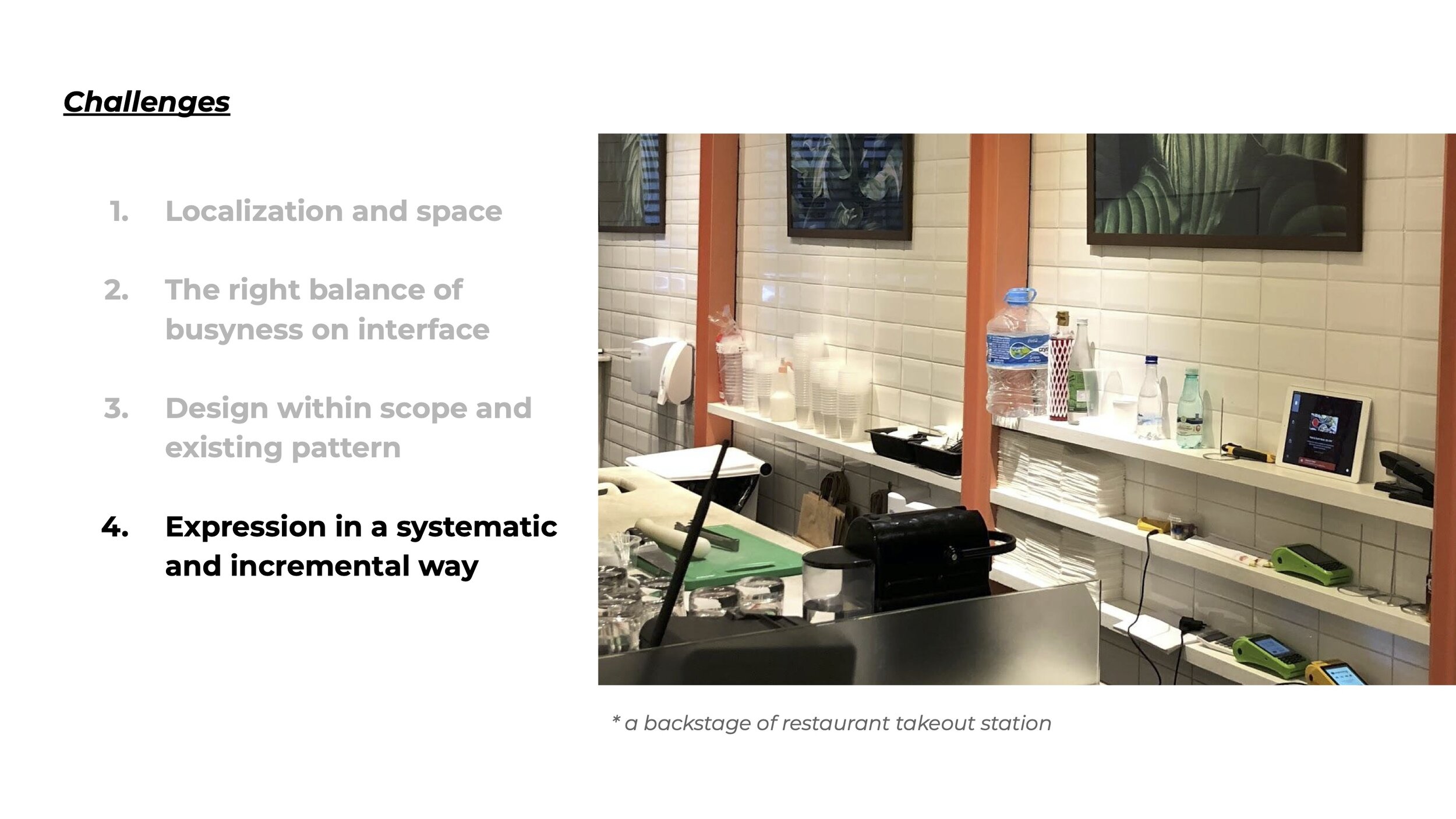
It is almost certain that at dinner hour of a busy yet understaffed restaurant the delivery tablet is lying at the corner somewhere unattended. The restaurant staff, meanwhile, are overloaded with their tasks and can’t afford much time to pay attention to the tablet. Identifying how much attention a status is required from the staff is key to this restrained environment, therefore I started solving the problem with prioritizing the different situations and creating a framework where each status would find its place of importance.
To do so, I evaluated each status and determined the different levels of attention needed from restaurant staff. I found that all above statuses could be categorized into three levels:
Level 1. passive
no attention needed as it’s regular routine state;
Level 2. informative
still regular state that restaurant self initiated so we remind them;
Level 3. alert
something is wrong and restaurant needs to be alerted.
(Attention Intensity Scale)
↓

Attention Intensity Scale
What’s great about it?
With this framework, statuses will receive design treatments based on severity level and later on if there are new statuses added to the system, they can sit in the appropriate level within the framework.
Design a system language
How do we translate the framework into user interface? To carry on the incremental spirit of the intensity framework, I created a visual language utilizing the same component with additional elements added on top of the previous level to create a consistent yet ascending expression.
(Process: explorations / challenges)
↓
After I identified the possible touch points on the screen, I tried out different variations and identified a few challenges or constrains during the process.
(final plan)
↓

. . .
(execution and details)
Level 1. Passive
Accepting Orders/ Outside of business hours
Tablet is switched between the two statuses depending on the time of the day. Since the business hours are set up by restaurants, “accepting order” and “outside of business hours” are considered two normal routine states and don’t need loud expressions.


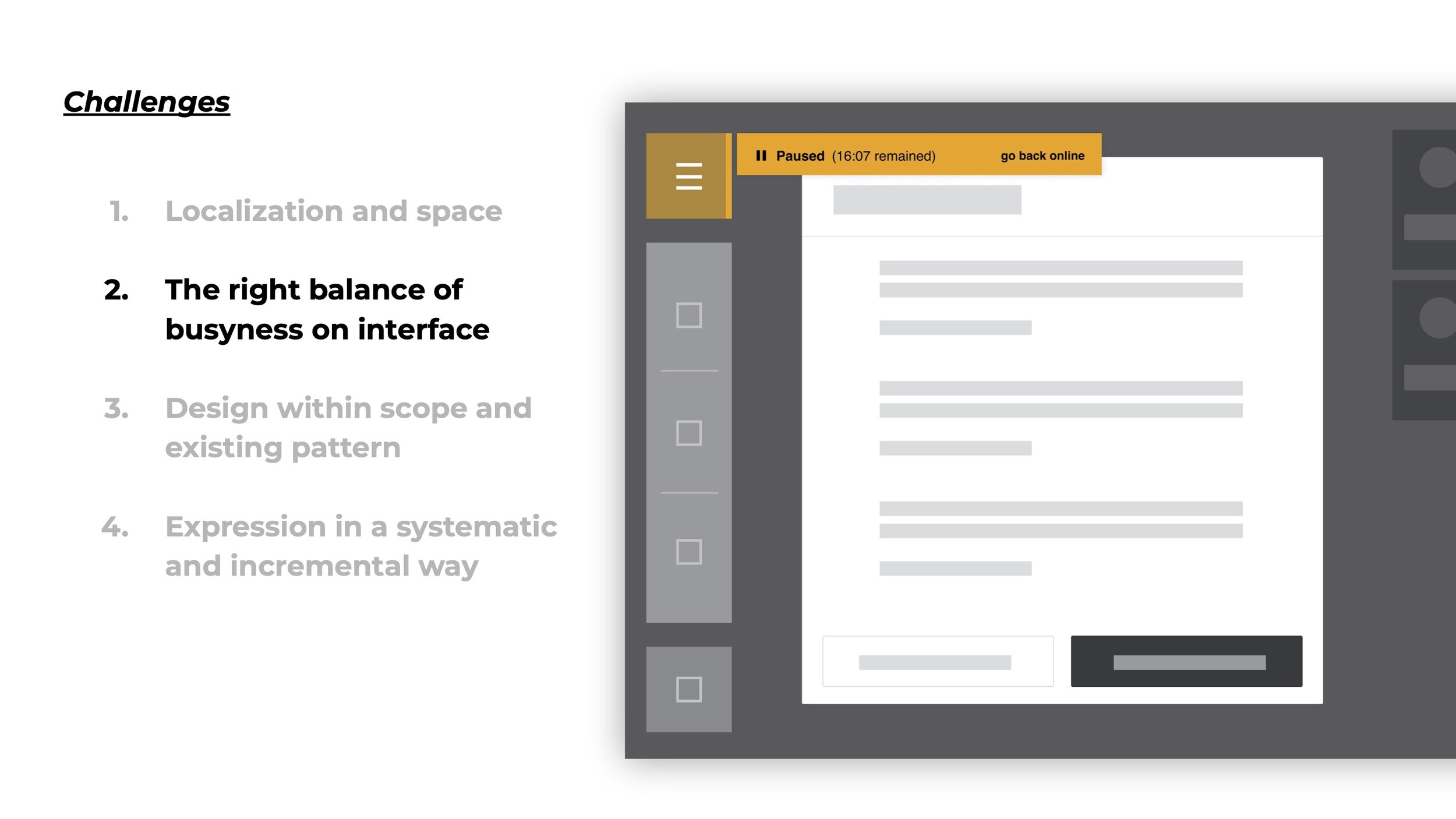
Level 2. informative
Paused
Paused is still considered as a regular state as it is triggered by restaurant staff. At a busy restaurant, more than one person might be in charge of the tablet, it is likely that one of the staff could pause the tablet and leave without informing anyone else in the restaurant.
We incorporate pulse effect to the hamburger button area to raise staffs’ awareness of the paused status. “Accepting Orders” and “Paused” can be switched from the side bar.

Set tablet to paused; pause count down can be seen in side bar.

When the main panel is clear (after all current orders are fulfilled), the background will show the countdown of pause.
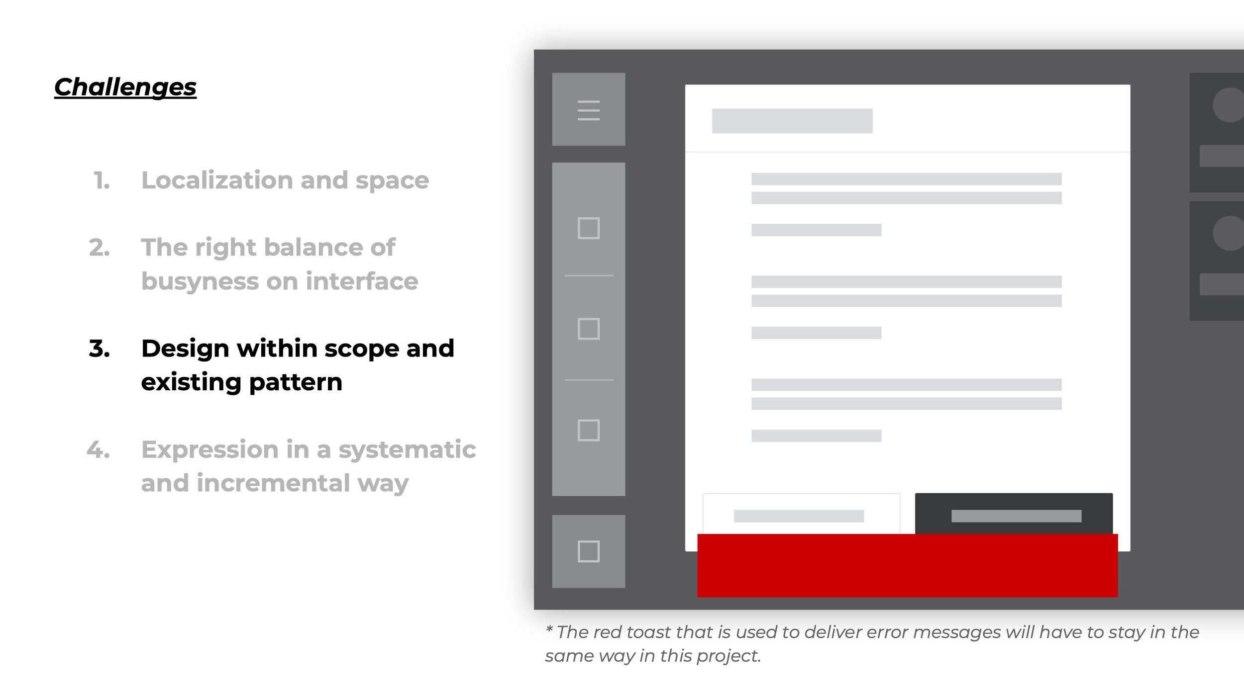
Level 3. Alert
No internet (Sample)
Level 3 statuses are those restaurants have no control on or need immediate actions. In addition to the impulsive effect button background, a toast will show up to communicate what happened and what actions are required.

Onboarding
Besides visual treatment, I also worked on the toast message to make sure it delivers clear information and suggests actions to take (if applicable). In the new design, I crafted the message on the onboarding toast so that the communication is more effective. Now users are clearly informed that they need to complete their setup in order to start receiving orders.

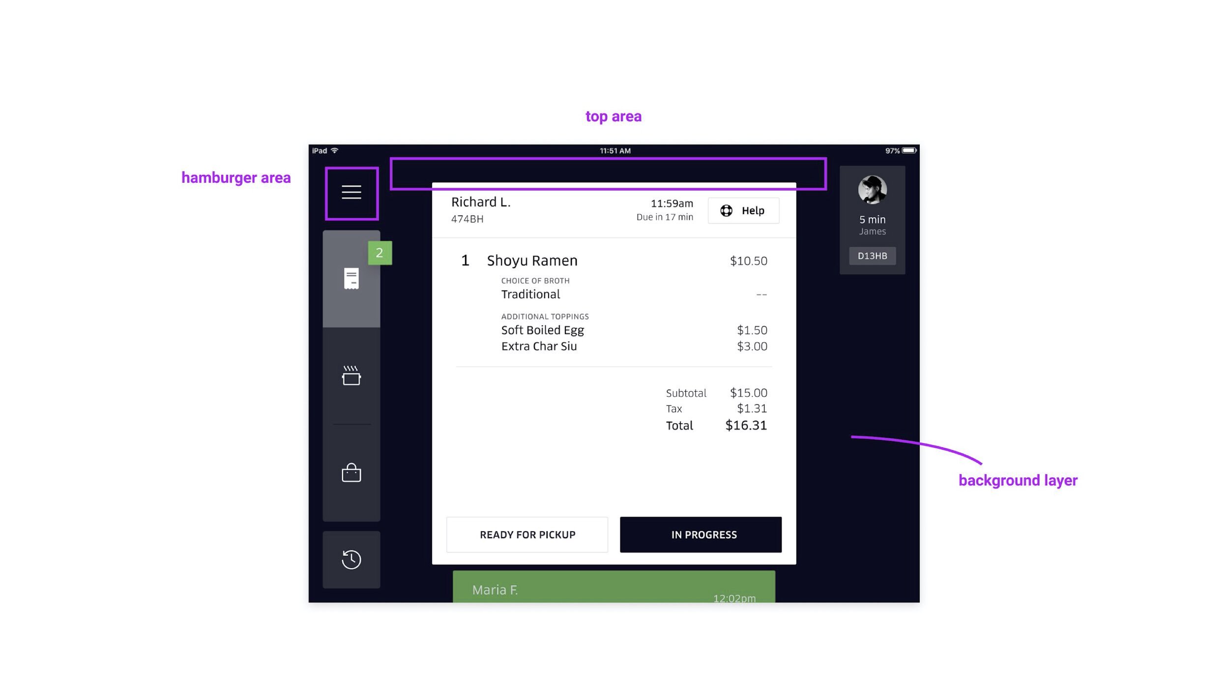
a brief view of Status indicator

Impact
Project Greenlight was launched globally in September 2018. As this project enhanced the clarity of restaurant status on the restaurant tablet, restaurant partners are more aware of their account status and availabilities on the Uber Eats platform. This promotes restaurants to take actions with more awareness. And we were happy to see:
68.71% increase on new restaurants proactively reach out to Uber Eats to accelerate their onboarding process,
which means it shorten the average onboarding window of new restaurants on Uber Eats.
Thanks you for reading!
Please reach out to me if you are interested in learning more design process :)